UX/UX Design | User Research | Web | Mobile
Kairos Calendar
Overview
Background
The Kairos platform was a sports operations SaaS platform.
The calendar was one of the earliest features on the platform, it was clear that it needed an upgrade to match the high standards of our other features.
The goal of this redesign:
• Enhance the calendar's flexibility
• Allow for searchability
• Provide more customisability to the user
Resulting in our power admin users having greater control.
Insights from users
The calendar prior to the updates was very useful but did not have much flexibility in both visuals and backend capabilities.
The filters would load slowly, the available customisation was poor, the event types and form itself were not simplistic enough.
Maintaining a positive user experience has always been a priority, as evidenced by our quarterly tracking of NPS scores.
Key improvements
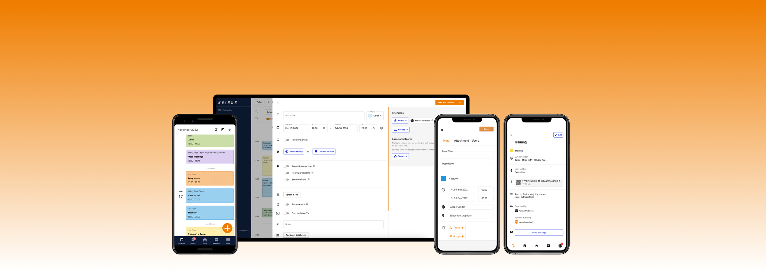
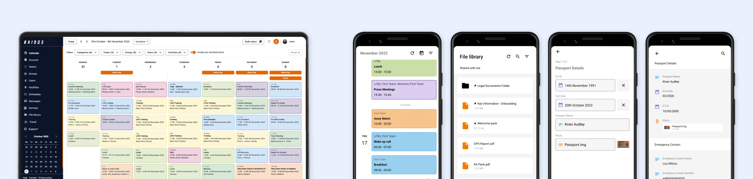
Designing a new event form, a mobile-friendly calendar, enhanced export capabilities, and detailed attendance reporting. This upgrade aimed to ensure that our users could manage their events more efficiently and effectively, significantly improving their overall experience on Kairos.

Event form prior to resdesign
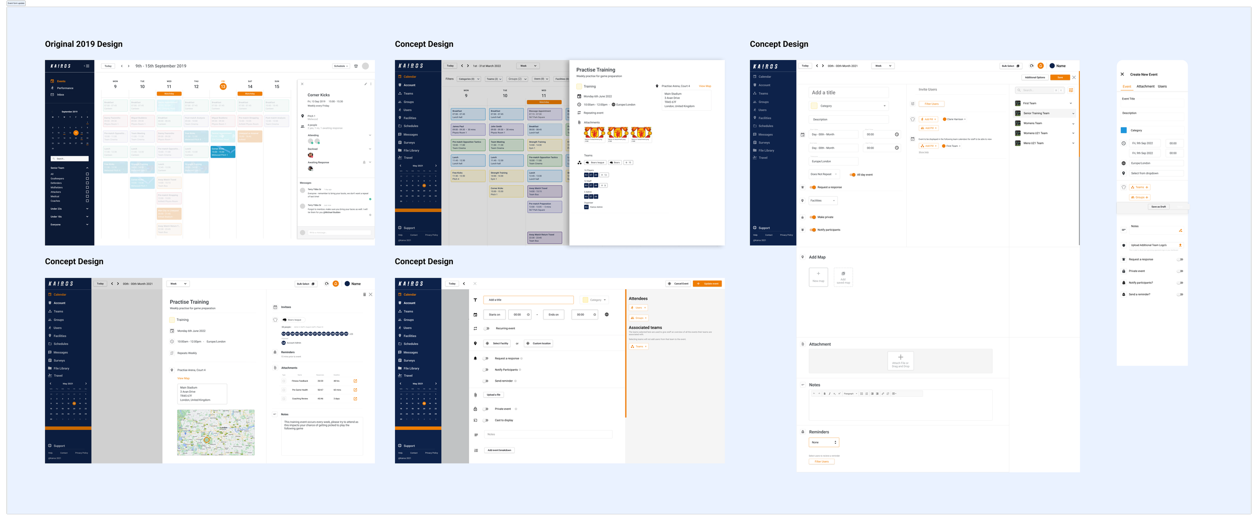
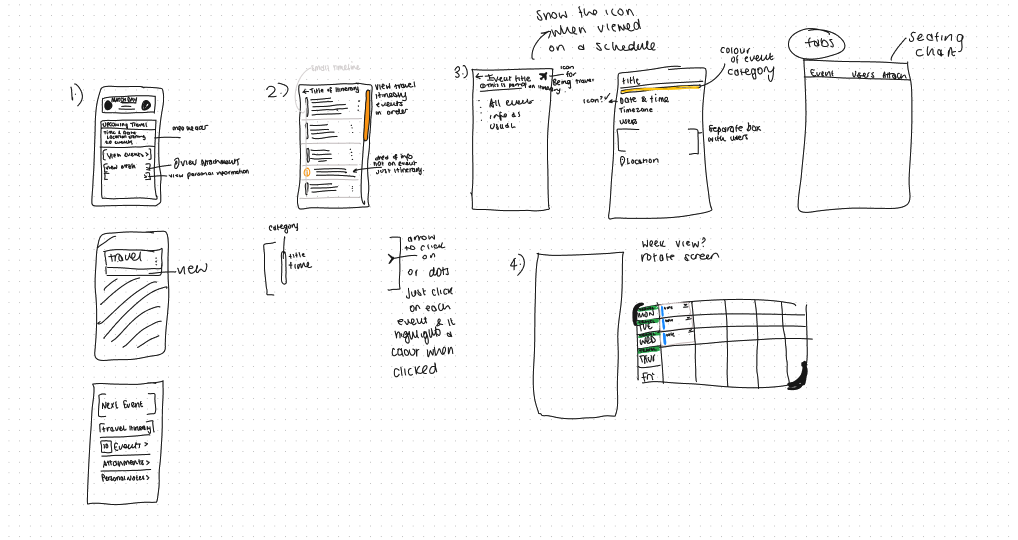
Concepting
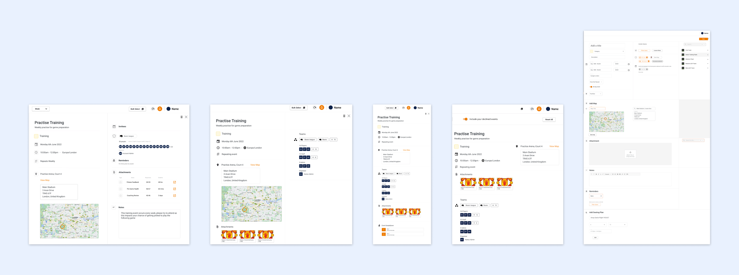
Event form layouts
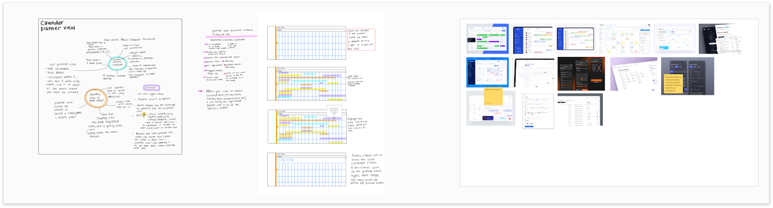
Research
I conducted user interviews with key stakeholders - asked them about everyday frustrations of using our calendar and get their opinion on what calendars they compare ours product with. Gmail and Outlook were the main competitors, which was not a surprise and we knew we had to evolve to their level.
The frustrations were very relevant to the competitors, but having more niche functionality within the event form was something unique to our calendar and what we discovered could add more value to their work life experience.
Takeaways
• Provide breathing space for more event customisation
• Allow an expanding drawer
• Enhance bulk actions to reflect users expectations
• Provide event category based information.
Flows and sketches based on research
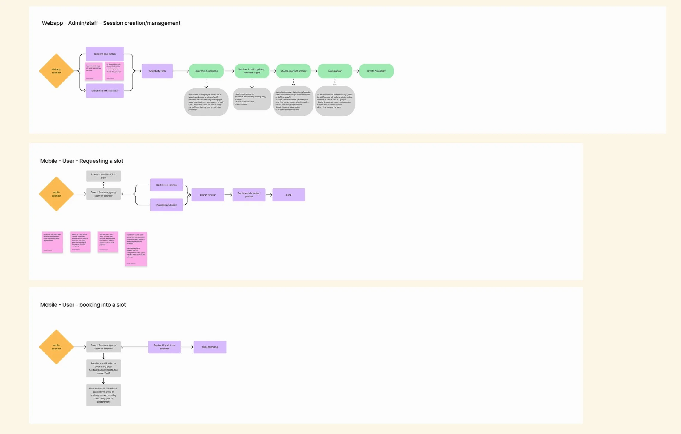
The Kairos product was used by a very wide range of demographics, so the experience was best presented to them in a clean and simple UI.
To maintain our easily understood flow in Kairos the event form was restructured with a focus to standardised the experience. The designs also explored how to push the functionality of the calendar event form with a goal to record the unique data and allow power users to report on it in the future.
Final Design
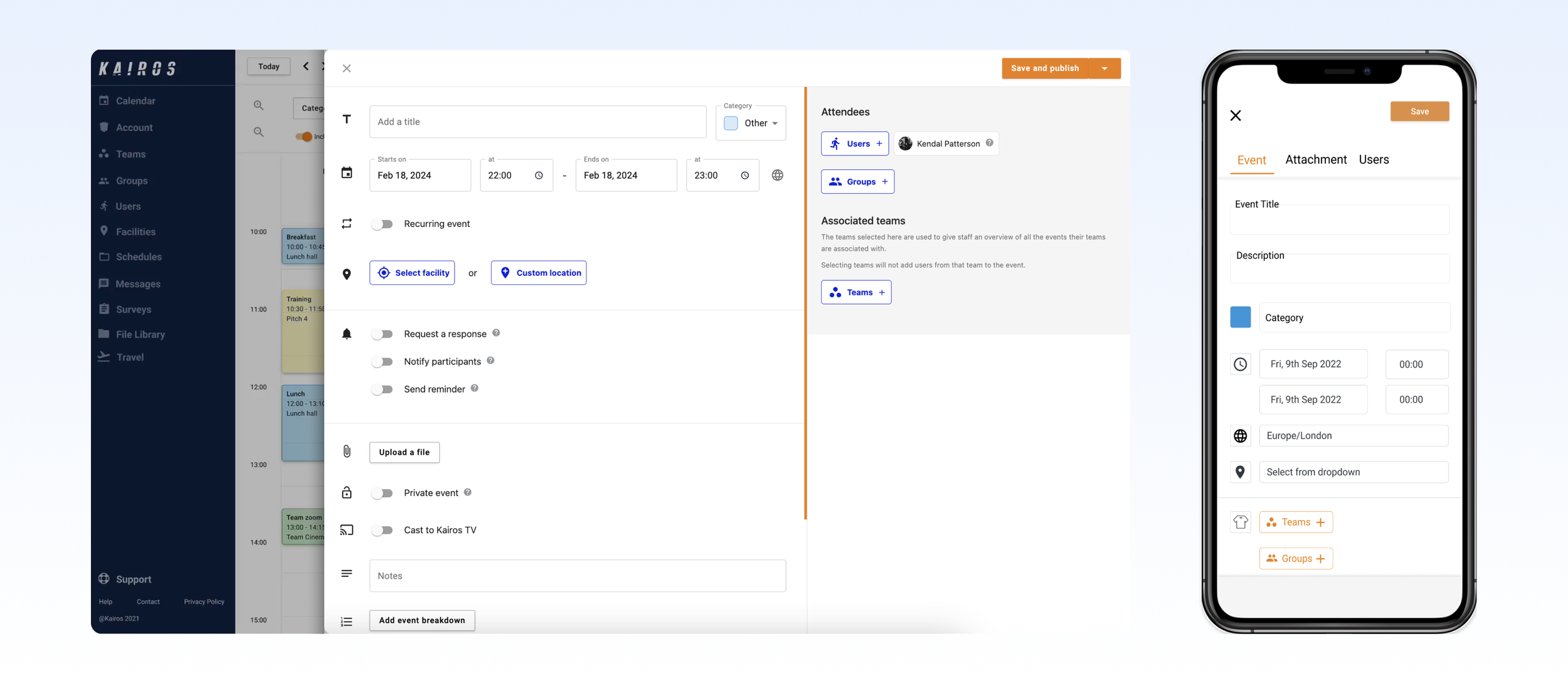
The final design of the event form significantly optimised space utilisation within the web app, allowing users to view information more clearly and reducing the need for excessive scrolling. On mobile devices, the already simplified design benefited from increased negative space, which improved user feedback as reflected in our NPS survey scores. Building on the success of this redesign, we continued to develop additional features aimed at further enhancing the user experience.
Post release additional features
Attendance reporting
Using the valuable post-release feedback from customer success, we introduced a feature that allows users to track attendance for individual events. This enhancement marks the first phase of our event reporting, aimed at providing tangible data to improve athletes' performance. Coaches and managers can record attendance via the mobile app, and with further development, a reporting view will be available on the web platform to track attendance over time. This feature is invaluable, offering the accountability that sporting organisations thrive on.
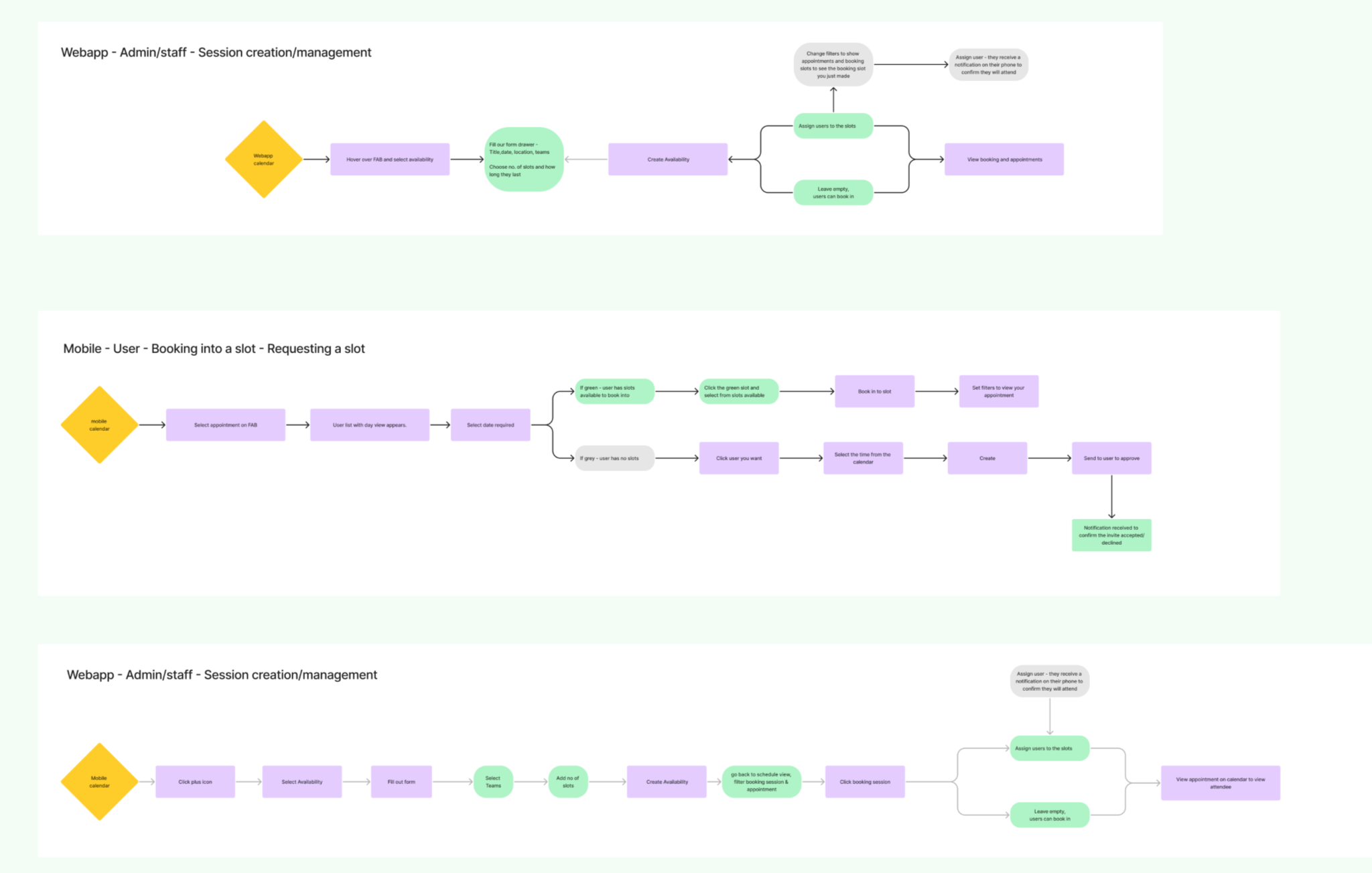
Availability redesign
The availability feature was closely tied to the booking slots and appointments functionality but lacked the simplicity and clarity users needed to navigate it effectively. This left many users uncertain about how to make the most of the feature. As a legacy feature, we decided to undertake a complete redesign, introducing a more modular and intuitive drawer system. This new approach allowed for greater customisation at a granular level and included slot grouping functionality, providing users with a clear, bird’s-eye view of appointment slots to improve usability and efficiency.